


Project Overview
The Relic, from Millon Wines, hails from some of Australia’s oldest and most respected wine regions. Product from Millon Wines are made to consistently display true regional expression. The Millon Wines team is passionate about its craft and committed to producing wines of exceptional character and balance. They are experienced and talented people with long and proud family traditions of viticulture and winemaking and a deep respect for our natural environment.
The commercial release of Relic presented a rare and limited opportunity to tap into the luxury wine market in China, where Australian wines are held in high regard.
Project Commissioner
Project Creator
Project Brief
Relic is a limited release Barossa Valley Shiraz. We were commissioned to design a gift packaging experience for this exclusive vintage that could entice Chinese wine collectors to part with the high-end price point of approximately $A700. The packaging needed to appeal to a sophisticated and international wine-savvy audience whose purchase would be for both corporate gifting and for personal consumption. The brief’s scope included naming, bottle design, bottle labels and presentation packaging.
Project Innovation/Need
Toast Creative needed to craft a brand narrative that could truly excite and intrigue the consumer going beyond just a clever name and a good looking label. The design solution for this premium gift-packaged wine took storytelling to a whole new level for the sector. Its innovation is expressed with creative suspense using a number of tactile elements to cleverly build the brand story. As part of Toast Creative’s innovative approach to the project, the team investigated traditional printing techniques to give the design an authentic ‘aged’ feel.
Design Challenge
The challenge for this packaging project was to appeal to the astute international fine wine connoisseur, specifically in the Chinese and Asian markets. Toast Creative’s design needed to remain within a strict cost per unit budget and be an exciting, engaged and unique user experience.
Effectiveness
The effectiveness of the Relic as a packaging project is most evident in its storytelling. By borrowing from one of our most popular historical events - the voyage of Captain Cook to our shores - a piece of Australian history is retold with a sophisticated sommelier twist. The client was very impressed with the outcome and reported excellent feedback from retail distributors.
The idea of The Relic was conceived as a version of the adventures of Captain James Cook and is a creative retelling of the historical events of 1770. Toast Creative tells a tale of Captain Cook and his crew on the Endeavour who find themselves shipwrecked on a reef as a result of a heavy load of the world’s finest Shiraz. With no other option than to cast the fine wine overboard to avoid sinking, Cook’s Barossa Shiraz is lost forever – until now. After many decades, the sunken relics have increased in value, rarity, and quality. And so ‘The Relic’ was born.
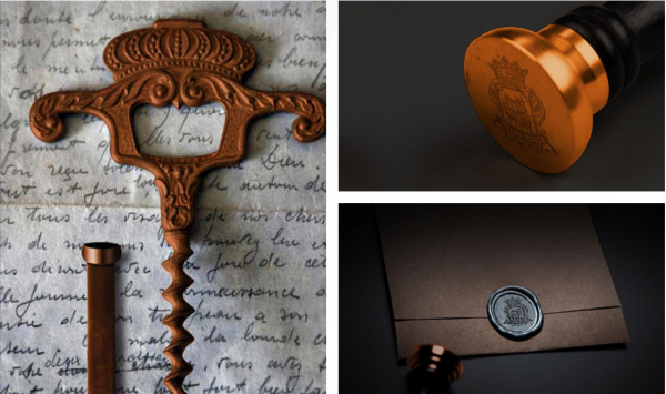
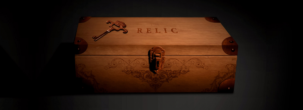
A custom, keepsake wine box houses each ‘find’ - a prized bottle of ‘vintage’ Relic. A custom, hessian bottle-wrap creates a reveal when unwrapping the gift that offers the surprise of a map referencing the wine’s Barossa location. The gift box also contains a document of authenticity, a rustic key - which also works as a corkscrew - and a book which continues the story telling, this time of the vineyard’s heritage and the production journey of this truly exquisite Barossa Shiraz.
The end result is an authentic and well considered kit of parts that makes a distinct and lasting impression.
Graphic Design - Three Dimensional
This award celebrates creative and innovative design in traditional or digital visual representation of ideas and messages used in packaging. Consideration given to: clarity of communication and the matching information style to audience; the approach, including marketing and branding concerns, the dynamics of the retail environment, environmental considerations, and legal requirements; the component parts of packaging graphics such as colour rationalisation, information layout, feel and tone of illustration and photography, and finishes, and how they are used in isolation and in relation to each other; and the relationship to the anatomy of the structural design.
More Details