



Project Overview
With customer expectations rising and the demands of changing government regulation, the spotlight has been shining more than ever on energy. This meant we had to rethink how we build and design our app. Build for constant change as we respond to our customer's needs. Designed to express our brand's ‘good energy’ promise. And most importantly, easy to use for everyone.
Organisation
Team
Chris Khalil - Head of Experience Design
Ben Tollady - Experience Director
Scott Hall - Creative Director
Stefanie Di Trocchio - Content Director
Keith Swann - Lead Product Manager
Bryce Larson - Lead Developer
Special mentions
Daniel Neville - Senior Experience Designer
John Sung - Lead Visual Designer
Gillian Rogers - Senior Content Strategist
Sarah Howard - Digital Product Manager
And the whole Digital Team at Origin (too big to mention)
Project Brief
How might we give customers the power of being in control of their energy?
Introducing the all-new, easy-to-use, beautiful Origin Energy app.
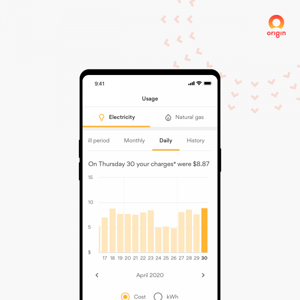
No more shock of receiving high bills, now customers can view their electricity, gas, solar & hot water consumption down to the day and even hour. Even receive insights to help understand variable usage rates and their bills.
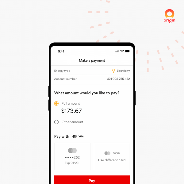
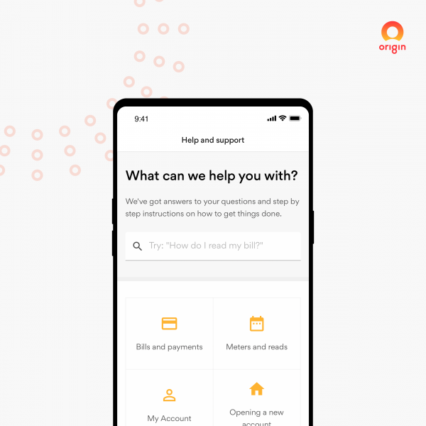
Pay how they want. In one tap, or set and forget with direct debit, then if things get a little confusing, we’ve put help and support a finger tap away. With live chat,100's of support articles and videos, getting help the way they want is easy.
Now that’s good energy.
Project Innovation/Need
Large corporations have a stigma of moving slowly and releasing sub-par solutions for it’s customers. Not Origin. We built the app both smart and beautiful.
We started by getting our technology foundations in place to ensure speed to market. By choosing the cutting-edge technology React we enabled features to be built once and simultaneously released to both our apps (iOS and Android) and the web. But deploying fast usually means a trade-off of experience. This wasn’t the case. In parallel to building the platform, we designed and built a beautiful AA compliant Design-System that expresses ‘good energy’ underpinned with a minimal yet contemporary feel. This empowered teams to design different features at once and maintain high quality consistency and usability.
By being in a category that used by everyone, we were mindful of creating non-conventional usability patterns that would challenge learnability, so a strategic decision was made to focus on 'doing the basics beautifully' so everyone could use our app.
Design Challenge
The challenge of maintaining a high level of consistency and usability is hard enough. It’s made even harder when multiple teams are working in parallel designing for two different platforms plus the web.
Our solution - to create a Design System that uses conventional web and native app patterns. The patterns could then easily translate and adapt to the platform it’s being used in. This was the result of a strategic decision to empower everyone who uses the app to do so without having to learn non-conventional patterns. Simply put, ‘design the basics beautifully’. The system continues to resemble Google’s Material Design, elegantly themed to be iconically Origin.
User Experience
Quite a lot of our figures are confidential, but we can share the following. And they speak for themselves.
• #1 app in the Utilities category on Apple App Store November 2019
• 4.2 star rating (4.8K reviews) Apple App store
• 4.6 star rating (800+ reviews) Google Play store
Digital - Corporate
This award celebrates innovation and creativity in design of a unique user experience in the combination of text, audio, still images, animation, video, and interactivity content for websites. Consideration given to clarity of communication and the matching information style to audience.
More Details

