


Project Overview
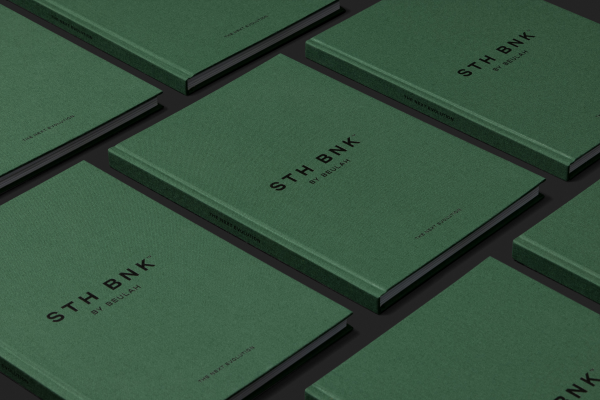
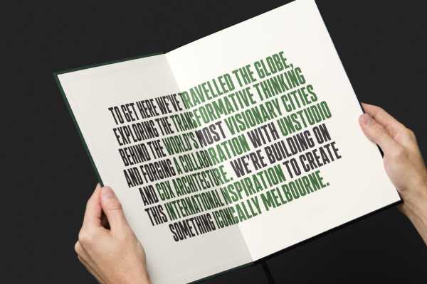
The much-anticipated Melbourne precinct, STH BNK By Beulah has been some years in the making. Travelling the globe undertaking research and discovery tours to some of the most incredible cities, Beulah set-out to create a visionary 24/7 precinct, a mini metropolis for Melbourne, unlike anything ever seen before in this great city.
Inviting six of the world’s best architects to participate in a design competition for such a landmark development, Beulah set-out to create a sustainable world-class destination, ultimately selecting winning architects UNStudio & Cox Architects as the lead architect for the project with an incredible ‘green spine’ architectural design response.
Project Commissioner
Project Creator

Team
Creative Director: Rob Davies
Client Service Director: Bianca Lanza
Copywriter: Letterform
Architect: UNStudio & Cox Architects
3D Visualisations: Stab Studio, Norm Li and Binyan Studios
Fantasy 3D Visualisations: Collider
Printer: Press Print Solutions
Project Brief
Grenade was engaged to develop a marketing campaign and sales collateral to support the launch of the residential offering at STH BNK by Beulah.
With residential being such a significant component of the development, a brochure publication was a key marketing tool for the sales team to leverage from, but ultimately it needed to communicate more information than a typical residential brochure.
Project Innovation/Need
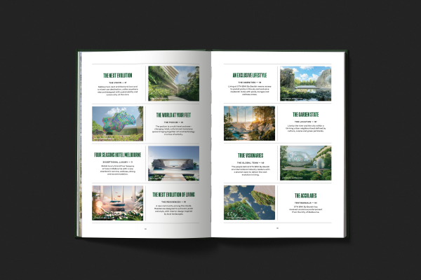
Unlike traditional property publications in the residential, mixed-use, commercial and industrial space, our approach with STH BNK was to bring an element of ‘aspirational fantasy’ which could visually communicate the mood residents, visitors, retailers, and hotel occupants could experience at STH BNK. We achieved this through a series of visually dynamic chapter spreads and large eye-catching breakout copy, large heading styles and quotes allowing readers to skim through the content quickly. We designed multiple variations of grid systems to house photography and marketing renders and a keyline treatment that anchored the design system universally across multiple design applications for the campaign.
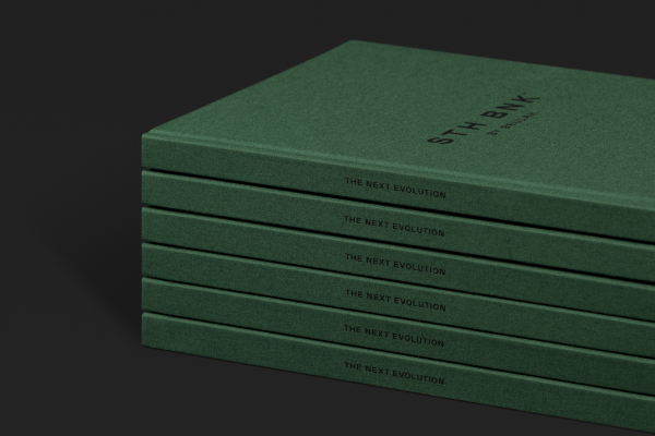
What started as a brief to promote the residential offering, quickly grew into an 180 page precinct brochure. With such a large-scale marketing brochure we needed to create a modular design system that allowed the design to flex and remain visually engaging throughout.
Design Challenge
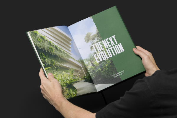
Initially when briefed by Beulah, the vision was to create a residential publication. Without the support of a precinct brochure, we quickly identified this publication needed to do both – Communicate to the target audience the projects broad precinct offering as well as present the residential offering. A two-fold approach.
An aspirational development in every sense, the publication’s tone of voice is visionary but intentionally effective in its simplicity to communicate with the various target audiences. Because the development offer is unlike anything ever before seen in Melbourne, the copywriting, publication design and imagery needed to reflect this. Uncomplicated in its presentation, the challenge ultimately lay in delivering such a large volume of content in a digestible manner that could easily be understood by anyone who is lucky enough to receive a copy. The publication was and currently is being used as a primary selling tool at the project’s immersive display hub.
Effectiveness
Achieving an incredible $400M in sales on launch weekend alone, the STH BNK by Beulah publication was an integral item within the overall sales and marketing campaign toolkit for the campaign – which achieved great success. Alongside the brochure, the campaign was supported by print advertising in various publications, supported by online advertising, continued stream of PR activity and a strong presence on Beulah’s social platforms.
Graphic Design - Publication
This award celebrates creative and innovative design in the traditional or digital visual representation of ideas and messages. Consideration given to clarity of communication and the matching of information style to audience.
More Details