


Project Overview
Brand identity for SHIO, a Japanese restaurant/yakitori in Hong Kong. Located in the finance hub of the city Central,
Project Commissioner
Project Creator
Team
Design Direction: Billy Cheung
Illustration & Design: Gloria Mak
Graphic Design: Gloria Mak, Billy Cheung
Project Brief
Located in the finance hub of the city Central, SHIO offers a unique blend of experience, encompasses the original tastes of Japanese yakitori.
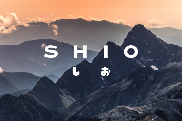
The naming was an initiation from the Japanese word "salt", it was derived from the Japanese words "shio" (塩) meaning salt and "yaki" (焼) meaning barbecue. In the Japanese language, SHIO (しお) has the meaning of "salt", it is the fundamental ingredient for seasoning in cookery.
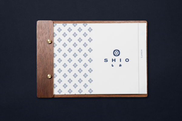
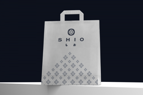
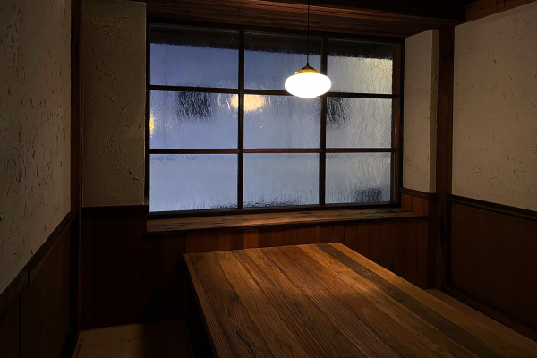
As a sensational touch, the brand identity is defined by a logo mark of graphic and type pronounced by the modeling of a castor with pepper and salt. The brand identity is extended across print, packaging and interior to create an initimate and peaceful atmosphere that brings customers a perfect escape from the city's hustle.
Japanese cuisine is traditionally rich in variety of taste, texture and color. It is also known as a food culture in which the ingredients are appreciated for their natural raw state.
Project Innovation/Need
Our goal was to design an identity to introduce a new Japanese yakitori restaurant to the Hong Kong market. Despite of the popularity of modern and trendy minimalist styles, we decided to go with the traditional and poetic Japanese atmosphere for the brand identity to raise brand awareness.
Design Challenge
The most difficult challenge was the communications between us and the client, the both parties were separated into two places at the time when the project conducted. We can only communicate through video calls. That could be challenging for clear and effective communications. However, we have managed to achieve an excellent outcome of the project.
Effectiveness
The carefully crafted brand identity and shop interior have since drawn the awareness of many Japanese cuisine lovers. However, due to the raise of the pandemic cases across the city, the client was forced to close down for some time, we hope everyone stay safe and the business can be reopen as usual in the near future.
Graphic Design - Identity and Branding
This award celebrates creative and innovative design in the traditional or digital visual representation of ideas and messages. Consideration given to clarity of communication and the matching information style to audience.
More Details