


Project Overview
Digital banking is here to stay, accelerating change across the industry. Within this landscape and the rise of global and local competitors, banks are constantly iterating, simplifying and improving their services to keep up.
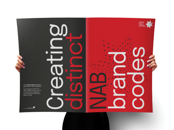
NAB needed to make a bold, brave shift to strengthen its brand positioning as the experts in ‘more than money’. And the bank that really gets modern Australians.
Working closely with NAB’s Brand Identity team, we embarked on a journey to evolve its identity and inject more energy, youthfulness, flexibility, accessibility and digital fitness into its system.
To make a creative impact and drive brand distinctiveness, we ‘freed’ NAB’s hero brand code, the iconic 7 point star, from its fixed position to an indispensable brand asset with the power to outshine our competitors.
The result is an idea-driven, adaptable, and continually evolving identity that’s setting the pace in the Australian financial industry.
Project Commissioner
Project Creator
Team
Simon Wright, Executive Creative Director
Aimee Coleman, Director Principals AlphaLab
Hamish Cargill, Director Brand Language
Wayde Bull, Strategy Director
Dan Bradley, Director Experience Design
Martin Hopkins, Creative Director
Yolanda Koning, Design Director
Jemma Barry, Account Manager
Cera O’Grady, Senior Account Manager
Ashley Ng, Account Manager
Andrew Thompson, Design Director
Agus Wijaya, Senior Designer & Motion Graphics Designer
Hayden Mathys, Motion Graphics Designer
Dean Varndell, Head of Motion Graphics
David Cunningham, Head of Production
Matt James, Designer
Niamh Slevin, Writer
Alex Moore, Senior Writer
Ben Williams, Senior Creative Artworker
Nathan Mcilvain, Creative Artworker
Mary Winter, Insights Director
Elmira Gaynullina Insights Consultant
Project Brief
NAB’s ‘more than money’ brand promise has never been more relevant. In 2006, we evolved NAB’s Masterbrand identity. And according to customer research in 2021, this evolution solidified NAB’s leading position and the power of its iconic red star.
But in a COVID-affected world, the research also suggested that customers were looking for more humanity, authenticity, and openness. So, we set out to achieve this.
With a complex system and iconic brand codes already in place, we needed to create a seamless customer experience while finding new ways to evolve into an energised brand for the modern multiscreen world.
A flexible design system was key. Allowing NAB to tailor communications across channels and its diverse and global audience – from everyday banking customers and small businesses to large enterprises and institutions.
With the goal of bringing more humanity to the brand, we needed to bring NAB’s diversity, inclusivity and accessibility ambitions to life across the identity, especially in photography.
Ultimately, our challenge was to evolve NAB’s identity system and bring a new sense of bravery, energy and distinctiveness to a traditional, conservative category.
Project Innovation/Need
Freeing the star – allowing NAB’s most famous brand code to be a standalone asset and shorthand for NAB. We freed the star from its corner and put it front and centre – integrated with photography, as a pattern, or a graphic device to house ideas and content.
This move created a significant boost in brand attribution, helping people quickly and unambiguously recognise NAB across its communications. And proprietary research conducted in 2022 revealed it was already starting to pay dividends, with measurable gains.
Building a brighter red – NAB’s new signature red helped create a more vibrant colour palette and supported our goal of digital fitness. Our research confirmed its distinctiveness and increased recognition as part of NAB’s strong red, white and black colour palette.
New directions in photography – With humanity and authenticity at the core of the brand evolution, we set out to represent real Australians in all their diversity. We invited NAB team members to turn their cameras on themselves and provide self-portraits for NAB’s customer communications. This was the perfect way to authentically capture who NAB really is.
Radical simplification – We consolidated the brand colour palette to just three core colours and reduced the font range. By systematising several NAB Masterbrand logos and related sub-brands, we simplified, aligned and evolved NAB’s brand architecture system.
Design Challenge
Managing and resolving complexity – Our work needed to complement and elevate an existing and complex system across customer, product and service groups, plus all the channels NAB communicates through.
Idea driven creativity – Driven by an ‘idea-first’ mindset, our innovative client pushed us to think bigger and braver to stand out in the market.
Stakeholder & change management – Creating change in a large organisation is notoriously difficult as people naturally become attached to the way things are done. From the beginning, we engaged clients across the business to help shape the brief and draw on their expertise for this major evolution. During the process, we collaborated with clients through robust, evidence-backed conversations. This way, we could involve teams to gain insights while keeping the work aligned to NAB’s mission and customer expectations.
Effectiveness
NAB’s new identity launched in April 2022 and early data shows that we’ve improved its distinctiveness across all our brand codes.
Our evidence-driven evolution has brought more energy and youthfulness to the brand, without compromising on NAB’s diverse range and style of communications.
Based on the research, we’ve boosted brand recognition by ‘freeing the star’ and evolving the brandmark, colour palette, typography, photography, illustration and patterns.
Graphic Design - Identity and Branding - Finance
This award celebrates creative and innovative design in the traditional or digital visual representation of ideas and messages. Consideration given to clarity of communication and the matching information style to audience.
More Details