


Project Overview
Nucleus Network is Australia’s largest and most internationally experienced Phase I clinical research facility in Australia, assisting global biotechnology and pharmaceutical companies to accelerate drug development, develop new medicines, and determine drug safety for global companies across the U.S., North America, Europe, and Asia Pacific.
HM. was commissioned to build a brand strategy that would unite its subsidiary sites and enhance the Nucleus Network brand presence. The purpose: to position Nucleus Network as the go-to for Phase I testing and stimulate new business growth.
When embarking on this journey with Nucleus Network, little did HM. know that we would be contributing to an organisation that would become the provider of choice for COVID-19 vaccine trials.
Project Commissioner
Project Creator
Team
Brand Strategy - Nancy Bugeja
Creative Director - Miguel Valenzuela
Designers - HM.
Copy - Alice Blackwood
Animation - Matt Langton
Website - Thirst Creative
Project Brief
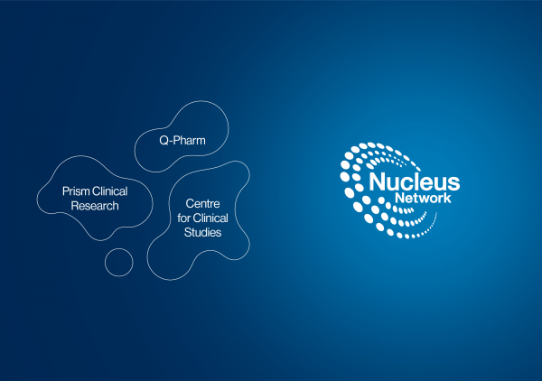
Nucleus Network conducts trials through its Melbourne site which carried its own name: Centre for Clinical Studies. In 2019 Nucleus Network expanded with two acquisitions: Q-Pharm in Brisbane, Australia and Prism in Minneapolis, USA. This positioned Nucleus Network as the world's only multi-site dedicated Phase I clinical research organisation.
To operate successfully, all brands and sites needed to be consolidated under the one Nucleus Network brand identity and communicated as Nucleus Network with single, compelling umbrella message.
Project Innovation/Need
Our process of discovery was extensive, incorporating customer journey mapping to help HM. capture participants’ end-to-end journey with the Nucleus Network brand; and findings and insights carefully documented to aid the project’s complex deliverables. These included brand positioning, architecture and idea, identity and language.
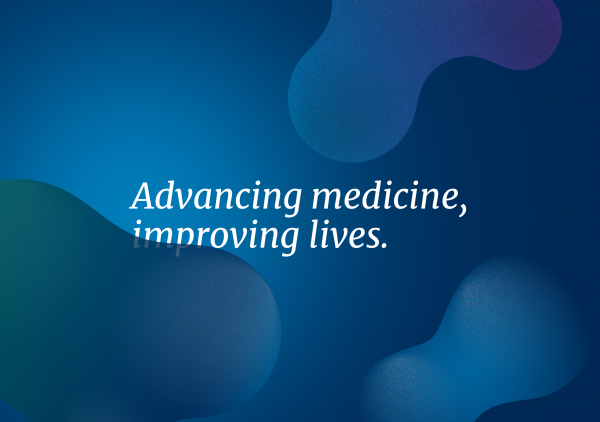
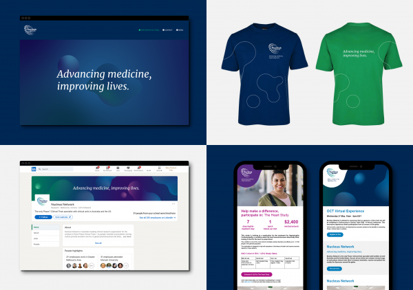
Developed in close collaboration with the client’s marketing team, the umbrella message needed to deliver a message that would tell the story of Nucleus Network's purpose, using language that would resonate with B2B and B2C audience segments alike. The outcome, one message for one brand: Advancing medicine, improving lives.
The brand architecture was specially developed to incorporate interim logo-marks to assist with a strategic rollout.
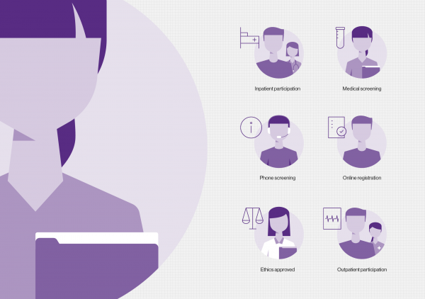
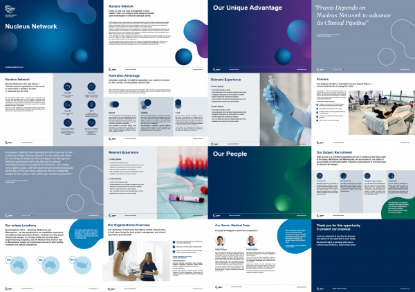
The brand identity’s system was created to be flexible, containing visual language that would successfully apply to a wide variety of touchpoints. These included eDMs, social media advertising, video and animation. The visual language expanded to iconography, illustration and aspirational photography to enhance and support the existing clinical photography style.
Design Challenge
There were a number of considerations we had to keep in mind as this project evolved:
A Nucleus Network logo existed and we needed to build a brand around the logo-mark and colour palette.
Acquired sites, Q-Pharm and Prism, were established organisations with their own culture and values that needed to be considered.
Prism had brand equity and would take on the new Nucleus Network brand message and identity with a strategy to transition over an 18-24 month period.
The website launch coincided with the brand launch which made timing a challenge as both components of this complex consolidation had to be completed simultaneously.
Effectiveness
The consolidated brand identity was rolled out successfully with an accessible brand toolkit contributing to a consistent branded communication and content across all sites in Australia and the US.
Nucleus Network is undergoing an exciting global transformation, operating successfully as a one-of-a-kind flexible, multi-site Phase I clinical research organisation, setting new standards across the sector.
Graphic Design - Identity and Branding - Community
This award celebrates creative and innovative design in the traditional or digital visual representation of ideas and messages. Consideration given to clarity of communication and the matching information style to audience.
More Details