


Project Overview
BaseUnit is a new series of light industrial storage/business parks consisting of small to medium sized warehouse storage units. The format of the units allow for the buyer to combine them for larger storage or operational requirements if needed. They are targeted at small to medium businesses from builders, tradesmen and light industries looking to secure workspace or storage in the Sydney region as well as those requiring self-storage or ‘man-cave’ spaces.
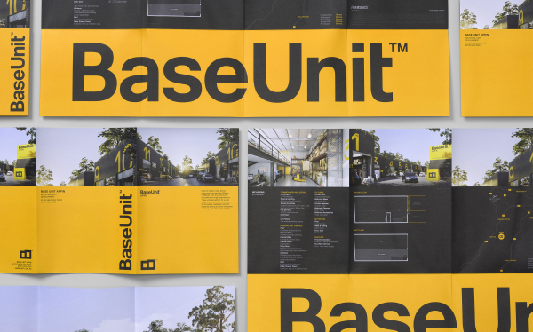
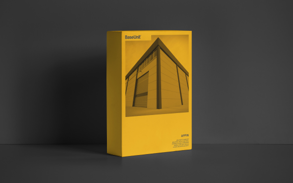
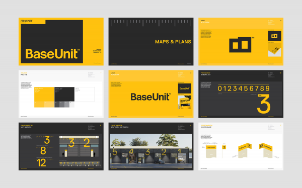
Hundredweight created the name, brand identity, environmental graphics & wayfinding system, marketing material and brand guidelines.
Project Commissioner
Project Creator
Team
Stephen Robertson - Creative Director
Martin Stone - Client Services Director
Project Brief
The brief for Hundredweight was to create a strong brand identity for a new series of light industrial storage/business parks rolling out across Sydney. The brand was to be distinctive and memorable as more BaseUnit warehouse developments are due to appear in the region. It also had to reflect the quality associated with the boutique developer – Formspace.
The target market is mostly small business operators largely in trades and distribution with some investors and people requiring personal 'man cave’ storage space.
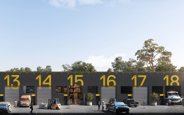
The core architecture of the developments is to be repeated and will inevitably become a strong part of the brand. Quite minimalist in form, the buildings also present an opportunity for an environmental graphic system to be fully integrated.
Project Innovation/Need
The BaseUnit name was born from its literal definition as a fundamental unit of measure - be it mass, length or time. Quite appropriate for a complex of storage units of varying scale, customisable for a multitude of purposes. The name also gave reference to being a potential ‘base' for business operations or leisure activities.
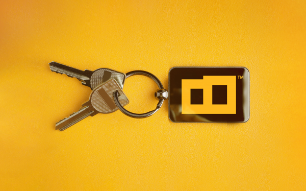
'Strength in simplicity' was a key driver behind the identity. The tilted ‘B’ icon brand mark takes the form of a simplified storage unit, particularly referencing the tilt panel concrete construction method used in the developments.
Rather than relying solely on park entry signage, the distinctive visual identity and its oversized use of unit numerals and measurement markers are integrated into the architecture. This, combined with the brand’s signature yellow colour, is clearly visible from the roadside.
Design Challenge
The storage/business park developments require flexibility in order to appeal to a wide range of audience types, from small to medium business operations, to families requiring self-storage or ‘man-cave’ spaces. Therefore, the brand identity itself also had to represent flexibility, appearing very approachable with an element of fun whilst also being utilitarian and ’no-nonsense’.
The tilt panel concrete construction of the buildings also makes them appear austere in nature. Our aim was to play this challenge to our advantage, echoing the minimalist form within the brandmark itself, as well as addressing the building’s appearance with bold, cost-effective environmental graphics.
Effectiveness
With units selling fast, Hundredweight successfully launched the first development of its kind in Sydney, highlighting a clear point of difference in the market – BaseUnit warehouse developments are more responsive to individual buyer's needs.
The name, identity and associated marketing material are confident, simple and clear in their brand purpose, presenting the storage/business parks as functional, accessible and flexible for a variety of uses.
The bold and distinctive environmental graphics build upon the brand’s recognition as more warehouse developments begin to appear in the Sydney region.
Graphic Design - Identity and Branding
This award celebrates creative and innovative design in the traditional or digital visual representation of ideas and messages. Consideration given to clarity of communication and the matching information style to audience.
More Details