Key Dates


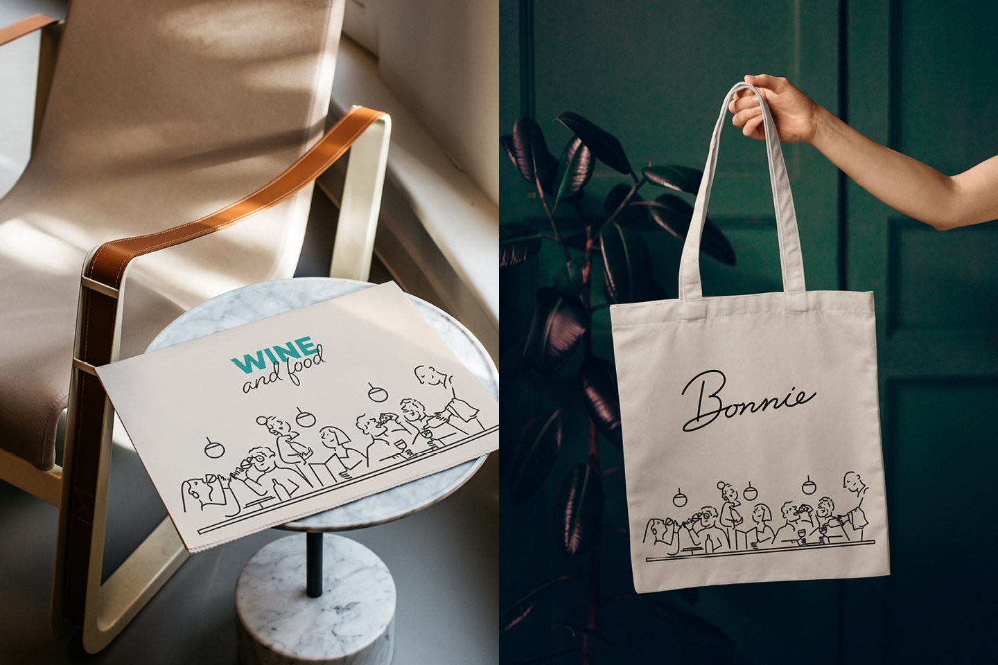
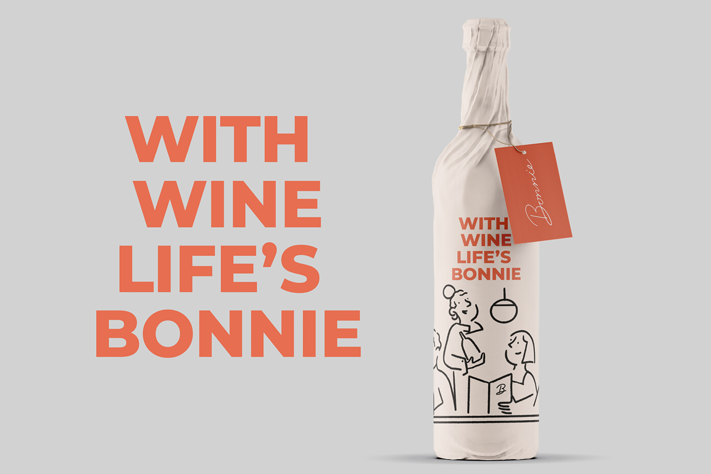
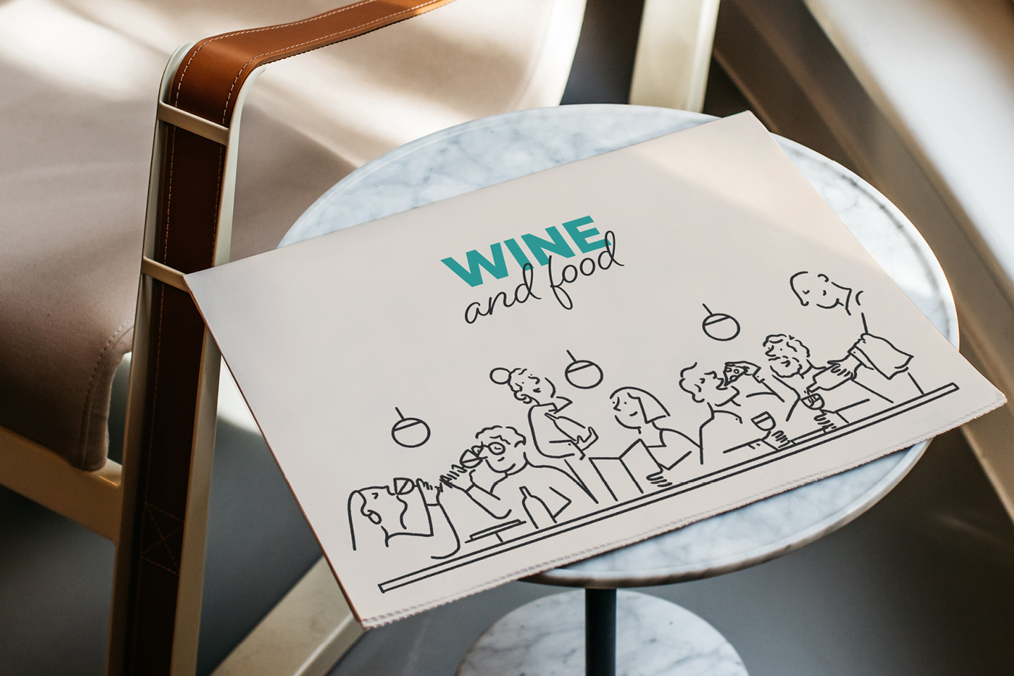
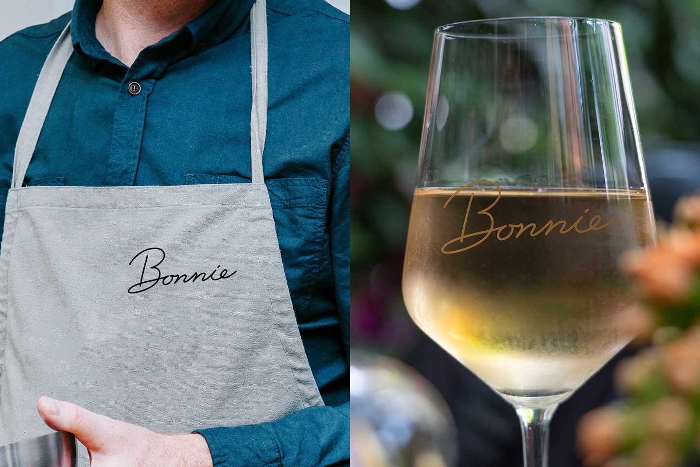
Image Credit :
Project Commissioner
Project Creator
Project Overview
Bonnie is a new restaurant offering at the All Saints Estate vineyard in Rutherglen. Located by the pond and with a view over the rolling lawn, Bonnie promises a fun, easy and casual meal with a generous spread of food, and of course wine. Among other considerations for this project, Bonnie is one of a suite of restaurants at All Saints Estate so it was imperative that the outcome of this project was flexible enough to fit with other graphics and brand identities.
Team
Project Brief
All Saints Estate approached us with a clear brief and the restaurant name already established. Bonnie, meaning beautiful in Scottish, was inspired by the heritage of the restaurant location and heavily influenced the tone of voice we developed when creating the brand story and overall identity. It was important that the Bonnie brand partnered well with the All Saints Estate identity and they were easily recognised as related brands. A familiar characteristic of the All Saints marque is the cursive typeface; we carried this notion across to the Bonnie logo, presenting it in a more contemporary form with heavier lines and smoother curves. Accompanied by illustrative elements that speak to the casual dining experience and relaxed nature of the brand, the new Bonnie identity is less about lofty occasions and more about beautiful moments.
Project Innovation/Need
The Bonnie establishment was born out of a need, a need for the return of beautiful everyday moments that have been missed these past two years. Hosting a timeless identity, we developed a brand that represents pure enjoyment and a relaxed dining experience, attracting locals and visiting tourists after a delicious spread of food or glass of selected wine. Our goal was to reflect this highly considered brand story and creatively depict the memorable conversations, delicious tastings and overall relaxed artisan vibe that is Bonnie. The illustrative elements of the identity were a big component of our design direction, we took inspiration from nature and heritage listed architecture which is prevalent in the surrounding areas - to collectively represent the simplicity of beautiful moments.
Design Challenge
This brand project required the management of many moving parts. In conjunction with the Bonnie brand being developed, the food menu was evolving and the architects were continuing to build the physical space. Navigating these roadblocks meant aligning a brand identity with a counterpart that was not yet finalised. We tackled this challenge by sticking to the brief - following the guidelines that were set and marrying Bonnie's values and phrases with our creative brand outputs. We took inspiration from the existing brands under the All States Umbrella and eventually overcame the design challenge.
Effectiveness
We identified the need for a broad collateral scope, one that could be applied to the physical aspects of the identity. This involved aprons, menus, wine glasses and small pockets of the eatery, all coming together to build brand recognition and create a strong voice throughout the dining space. These tactile elements were thoroughly considered throughout our design process and came to be effective in communicating the Bonnie brand story of ‘beautiful moments with family and friends’.
Graphic Design - Identity and Branding - Tourism
This award celebrates creative and innovative design in the traditional or digital visual representation of ideas and messages. Consideration given to clarity of communication and the matching information style to audience.
More Details