


Image Credit : Mucca

Project Overview
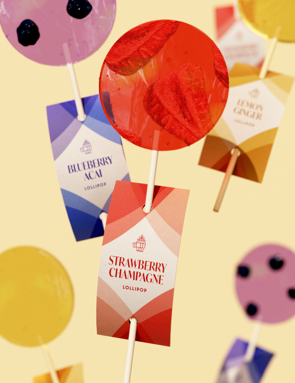
The Spoiled Parrott is the candy store within the food hall Tin Building by Jean-Georges. Mucca created the name it's branding and the whole line of products, from lollypops to chocolate bars.
Project Commissioner
Project Creator
Team
Sean O'Connor: Senior Designer
Yoon Choi: Project Manager
Karla Pasten: Designer
Matteo Bologna: Creative Direction
Jennifer Fistere: Naming
Project Brief
The client's request was to create a brand that was part of the food hall but with a distinctive look that would set it apart from the rest of the venues, and be considered a self-standing entity.
Project Innovation/Need
We created a brand that celebrates the wonder of childhood candy stores.
That meant coming up with a name and voice for the candy store that quickly established it as its own entity but still felt at home under the Tin Building umbrella. Tapping into the similarly nostalgic vision for the Tin Building, Mucca chose the name Spoiled Parrot – a phrase borrowed from a stanza from “This High Meadow” by the 13th-century Persian poet and scholar Rumi, an excerpt which belongs to the collection of poems entitled “Bridge to the Soul”:
“I am a spoiled parrot who eats only candy.
I have no interest in bitter food”.
This audacious spirit and tone of the bird, as well as the architecture of the space, then guided the rest of the identity from the logo, color palette, and packaging system, to signage. For the logo, rather than leaning into more predictable tropes of gluttony and sweets, Mucca proposed a different take on this idea of a spoiled bird.
Design Challenge
We knew that the packaging would be one of the primary touchpoints for those interacting with the brand for the first time. So, how could we convey this idea of a spoiled parrot without being literal?. Our solution was to have our parrot – missing from the logo – hidden in plain sight through the use of colorful, abstract, feather-like shapes throughout the identity.”
“Many parrots are not one solid color. They generally have feathers of different colors that appear to blend into one another", so we used this motif as a device for not only recalling our parrot but also – in a more practical sense – to help with flavor denominations. For example, some products were more straightforward like lemon jalapeño chocolates. With this flavor combination, fusing gradients of yellows and greens seemed to be appropriate. Meanwhile, for other flavors like pretzel pop rocks, we took more artistic liberties in the color selections. We also used reflective gold foils for the packaging to complement the feathery rainbow of hues. By using it on the logo and its accompanying icon, the graphics maintained their visibility regardless of the product and also gained a premium, timeless look and feel.
Overall, Mucca applied this design system across the confectionary packaging, shelf labeling system, ice cream menu board, exterior environmental window graphics, and even merchandise such as snow globes, mugs, and umbrellas.
Effectiveness
Mucca applied this design system across the confectionary packaging, shelf labeling system, ice cream menu board, exterior environmental window graphics, and even merchandise such as snow globes, mugs, and umbrellas. This holistic approach helps the guest feel immersed in this childlike world of wonder and solidifies the brand in their imaginary.
Graphic Design - Illustration and Type
This award celebrates creativity and innovation in the traditional or digital visual representation of ideas and messages. Consideration given to clarity of communication and the matching information style to audience.
More Details