Key Dates


Image Credit : Dianna Snape Photography

Project Commissioner
Project Creator
Project Overview
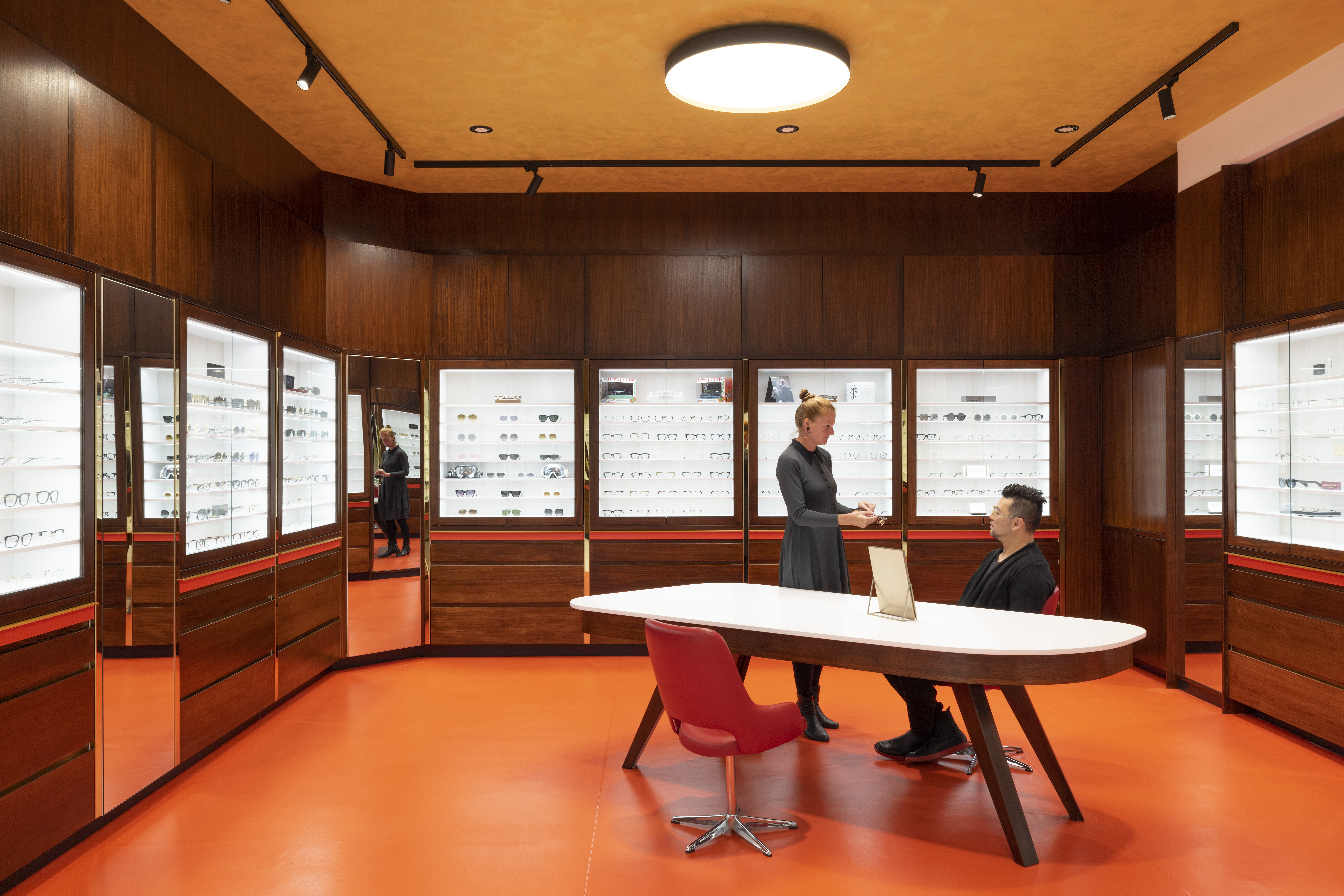
Four varied existing tenancies were seamlessly combined to form a cohesive, integrated, flowing space. An elongated shopfront creates a memorable arrival experience. Rather than vast expanses of glazing immediately revealing the store’s interior, the façade was treated as a visually striking, sculptural element celebrating the company’s brand. The undulating, intricately detailed brick façade cleverly incorporates allusions to eyesight. The brickwork patterning references pixilation. The sinuous façade segues seamlessly from convex to concave. Opaque white bricks morph to frosted glass bricks and then clear glass bricks, mimicking the transition from blurry vision to the clear sightedness. The fluid lines of the floor and ceiling, inspired by the curves in the frames of eyeglasses, cleverly lure the visitor from one end of the long, narrow space to the other, the product being splendidly showcased all the way, and ample concealed storage being provided within the beautifully detailed walnut display cases. The carefully considered material palette was inspired by materials commonly used in the frames of eyeglasses. Brushed and shiny metals are juxtaposed with the resin counter and timber joinery. The richness of these materials is enhanced by a warm colour palette of vibrant red and gold creating a textural and visual feast for the senses. This project is opulent, dramatic, creates memorable experiences and showcasing the product to its best advantages.
Team
Architect - ON Architects Andy Chung Builder - J&J Constructions Brick laying - RPM Contractors Structural Engineer - TGL Engineering Electrical & Mechanical engineering - Simpson Kotzman Consulting Lighting Consultant - Lux / FX Lighting Brickworks - Austral Bricks
Project Brief
How do we treat the 30 metres long and asymmetrical shop front? How can this design maximise the potential to create something memorable and functional at the same time? ONArchitects responded to a complex design challenge for Henderson Optical and created an innovative, visually striking, well resolved fitout which not only satisfies the client’s brief but excels expectations on many levels. The brief required four tenancies with very varied floor plans to be united into one cohesive space and ONArchitects succeeded in seamlessly integrating the original layouts to form a single, well-functioning shop. An elongated 30 metre shopfront to this tenancy offered a wonderful opportunity for ONArchitects to create a memorable arrival experience brandishing the business’ ethos. Rather than vast expanses of glazing immediately revealing the store’s interior, the façade was treated as a visually striking, sculptural element celebrating the company’s brand. The fluid lines of the floor and ceiling cleverly lure the visitor from one end of the long, narrow space to the other, the product being splendidly showcased all the way, and ample concealed storage being provided within the beautifully detailed walnut display cases. In all, this fit-out offers the visitor an opulent and dramatic experience. It entices patrons on a journey throughout the length of the interior, showcasing the product to its best advantage and providing comfortable areas to rest and reflect.
Project Innovation/Need
Every component of a typical retail interior was questioned, and nothing taken for granted. The usual glazed shopfront was replaced with a sculptural, undulating, intricately detailed brick wall providing a dramatic first impression before the interior is revealed. Upon entering, patrons are greeted with the breathtaking, geometric reception area, setting the scene for a luxurious customer experience and sense of occasion throughout the journey through the store. Numerous subtle references allude to all things optical, adding to the depth and creativity of the design response. The gentle curves of floor and ceiling and the material palette were inspired by the frames of eyeglasses. Brushed and shiny metals are juxtaposed with the resin counter and timber joinery. The richness of these materials is enhanced by a warm colour palette of vibrant red, orange and gold. Either end of the store opens into a larger area, providing room for freestanding tables and red leather chairs, allowing customers an opportunity to review their selections. Eyewear stores often have a clinical feel, with sterile lighting and expanses of white. Here, careful attention was paid to lighting design to create an atmosphere of warmth and opulence. This is an architectural response displaying design integrity and resulting in a well resolved, innovative, and alluring fit out for this store. The combination of form, texture, colour, and flowing space culminates in a magnificent, animated overall experience for those visiting Henderson Optical.
Design Challenge
The key design challenge was the creation of the complex, serpentine brick façade. The masonry contractor worked with architect Andy Chung to fine tune the detailing on site. Chung attended site almost daily to review progress and ensure the outcome was on track. Initially Chung used individual timber pieces to map out the curves of the wall’s footprint. The weight of the bricks determined the height of the wall, limiting it to 2,500mm – 2,700mm. Complex calculations guided the masonry contractor in the meticulous construction of the serpentine brick feature wall. The bricks are offset incrementally by 3mm, 5mm, 8mm, and 10mm in both directions to create the expressive curves. The bricks’ tactility is deliberately expressed, with corners and edges exposed. The result is an effective display of the physical, modular nature of brickwork. Careful attention was paid to lighting throughout. The lighting of the brick wall highlights its forms and textures. Internally, the lighting creates an atmosphere of warmth and opulence and illuminates the product to best advantage. A prototype for the display shelving was created 3-4 times to ensure the height, position and proportions were right, and viewing ability was maximized along with optimal lighting. This is an alluring architectural response displaying a high degree of design integrity. The combination of form, texture, colour, symbolism, and flowing space culminates in a magnificent, animated overall experience.
Sustainability
A conscious effort was made in the design of this project to source all materials locally and use only products available from Victorian outlets. This, in turn, reduced the carbon footprint. All lighting fixtures are LED and energy saving models were used wherever possible. The design and detailing of this fit-out have been resolved to a meticulously high level and will endure over time. Quite the opposite approach to built in obsolescence, this is a project where the quality of design and construction mean a built in resilience and robustness, sustainable for years to come.
Interior Design - Retail
This award celebrates innovative and creative building interiors, with consideration given to space creation and planning, furnishings, finishes and aesthetic presentation. Consideration given to space allocation, traffic flow, building services, lighting, fixtures, flooring, colours, furnishings and surface finishes.
More Details

