


Image Credit : Tanya Zouev, Mark Lobo

Project Overview
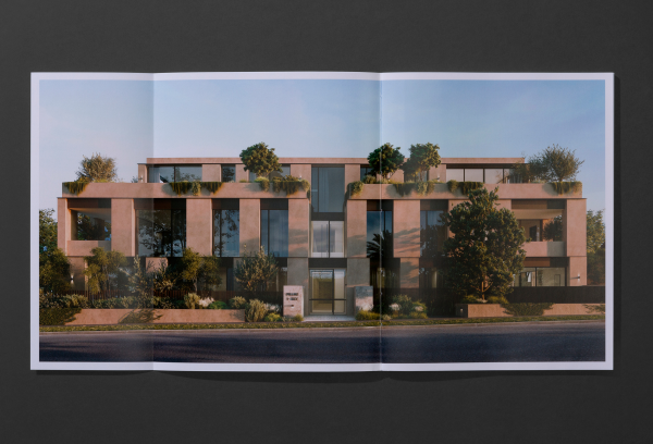
Only moments from the idyllic Brighton waterfront in Melbourne, Pillar+Tide is a boutique luxury residential development where every facet of modern life intersects seamlessly. Shaped by award-winning architects Carr, with landscaping by Acre, The Pillar+Tide brand identity and subsequent campaign materials were crafted to reflect the wonderful quality and duality of the residences themselves: a place where past meets future, indoors meets outdoors, community meets intimacy and time meets timeless.
Organisation

Team
Head of Marketing – Kristina Granberg
Design Director – Em Matthews
Content Marketing Manager – Liz Keene
Designer – George Hatton
Copywriter – Peter Maniaty
Render Artist - Mr.P Studios
Still Life Photographer – Tanya Zouev
Still Life Stylist – Kendra McCarthy
Media Agency - Giles Cain
Printer - Special T
Project Brief
The physical form of Pillar+Tide achieved a rich sense of timelessness and permanence, both in function and design, with a use of robust natural materials and a return to quality that consistently caters to the diversity of human experience. The Fortis creative team was tasked with creating an equally distinctive printed ‘hero’ piece as part of the wider marketing campaign.
Specifically, the piece needed to exude the outstanding quality of Pillar+Tide whilst communicating its unique characteristics in a way that resonated deeply with the needs – both emotional and rational – of potential buyers. It was especially critical for the tone and execution to cut through the noise of the highly competitive off-the-plan market in the recently re-zoned suburb of Brighton.
Project Innovation/Need
The overwhelming raison dêtre for this piece was to instil Pillar+Tide purchasers with confidence and reassurance. Purchasing a seven-figure luxury residence is a significant investment, so the publication was created to help convey the deep credibility and expertise of the Project Team.
Importantly, by this point in the customer journey we knew the receiver was already highly engaged in the design of the development. Therefore, the content was structured directly around our experts (architects, interior designers, landscapers, construction partners) with design intents articulated in their own words and demonstrated through renders and detailed design notes.
The piece itself is structed around interviews with each of the project heads, based on their areas of expertise – from why Fortis Director chose the site in the first place, to how the Cobild construction partners were ensuring the delivery of Pillar+Tide would perfectly support Carr’s original design vision. Detailed design notes, far more extensive than any other on the market, helped give customers the power to be informed of exactly what they were purchasing into.
Visually, the uses elegantly simple imagery (renders, still life and portraiture) with subject matter and lighting that moves from dawn at the start of brochure to dusk at the end. In doing so, it demonstrates the passage of time through our still building, perfectly reflecting our brand positioning ‘Still+Life’ and the name ‘Pillar+Tide’ itself.
Design Challenge
The design challenge was to create a hero printed piece for the Pillar+Tide brand in such a way that its voice would be clearly heard, despite the considerable noise (and, yes, collateral) present in the Brighton market.
Recently rezoned to encourage higher density living, Brighton is currently a hive of cranes and hoardings, with multiple boutique luxury developments all vying for the attention of the downsizer market. Rather than attempt to shout loudest, our design response was the exact opposite: understated, considered and quietly assured.
Like an art gallery, everything in the piece was stripped back to the purest of information. The content was created to provide a respectful presentation of the facts surrounding Pillar+Tide, as articulated (in first person) by the experts who actually helped us create it. A key benefit of teaching through the language of the experts is that recipients become the experts themselves—and, in turn, ambassadors for the underlying benefits on offer.
Effectiveness
Launching at a time when Melbourne’s apartment market confidence was at an all-time low, the Pilllar+Tide brand used emotive still life photography to successfully cut through the highly saturated Brighton market and resonate with our target demographic to achieve higher than average prices per sqm at sale time.
“The Pillar+Tide campaign set itself apart by providing a non-real estate based positioning. The imagery captures personal moments that our Brighton audience could relate to, which had a simple yet powerful influence over their perception of the project overall.”
Alby Tomassi, Tomassi & Co.
Graphic Design - Publication
This award celebrates creative and innovative design in the traditional or digital visual representation of ideas and messages. Consideration given to clarity of communication and the matching of information style to audience.
More Details