


Image Credit : Yasuaki Mio (KARAPPO) / Micheal Gazzola

Project Overview
Yakult is a world leading company in promoting the field of health science and is best known for their signature, everyday probiotic beverage. Their visitor centre in Dandenong South, which is integrated within the factory, welcomes approximately 10,000 visitors annually. The factory opens up to the public for viewings of the company's manufacturing process and conducts educational seminars about the importance of preventative medicine.
Studio Jigen was engaged to revitalise the existing facility, which has been in operation since 1994. We worked collaboratively with the client to create a fun and engaging space that showcases Yakult's company philosophy on human health so that visitors would carry away with them not only a better understanding of the importance of inner health but a long-lasting experience of what the company stands for.
Organisation
Team
Client: Yakult Australia
Interior Design: Kohei Nojima, Noriko Miltenburg (Studio Jigen)
Graphic Design: Mio Yasuaki, Mamiko Saito (KARAPPO)
Construction: James Wakelin, Damien Smith, Oliver Harrison, Alex Wood (Intermain Victoria)
Furniture Coordination: Jeffrey Low (Ergoline Furniture), KOKUYO International
Lighting Advisory: Daisuke Morita, Tomoko Yamamoto (Modulex)
Client Contact Coordination: Yoshinori Sakuno, Kota Nagami, Victoria Fang (doq)
Project Brief
Together with the client, we developed a project brief that focused on designing a space that could autonomously tell Yakult's story and articulate the company's scientific research and manufacturing process.
Our design methodology encompassed three key points – 1. Spatial expression of "Shirota-ism" – the company's ethos on human health 2. Creating a space that is educational and engaging and 3. Designing the space as a system of knowledge that celebrates the science.
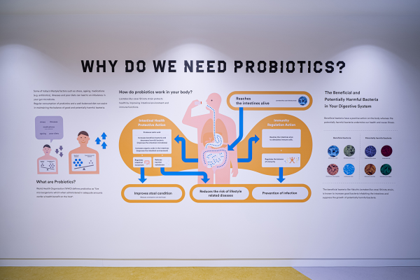
'Shirota-ism' is the company philosophy and is eponymous to Yakult's creator, Minoru Shirota. It highlights the importance of providing preventative medicine for sustainable health that is affordable. These principles form the basis of the company's spirit for education and research. Our design approach involved the translation of educational information provided by Yakult into a tangible experience, expressed through creative form and text.
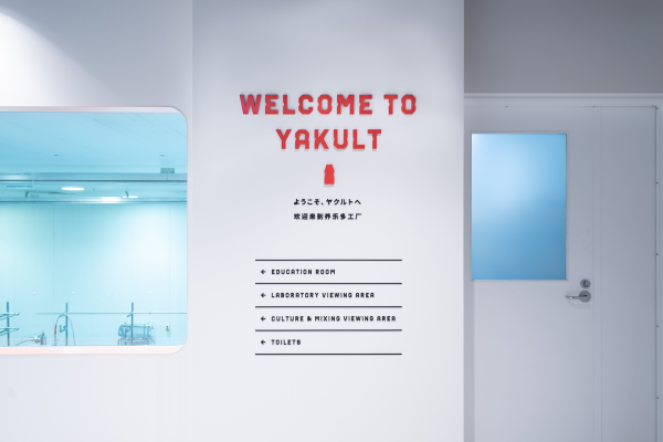
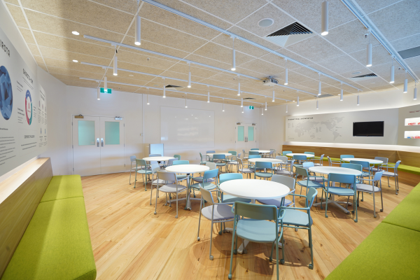
The brief also called for an interactive design that showcases the science and research behind Yakult. As the bulk of visitors are schools, representation of clinical information that is fun and accessible, was essential. Therefore, effective wayfinding mechanisms and re-programming of the existing spaces were needed for efficiency and flow.
Our design methodology also sought a balance between expressing Yakult as an institution for scientific research and an educational environment that encourages curiosity for children. Clean lines, precision, and carefully considered colour tones were designed into the space to evoke the sense of being in a laboratory that is fun and accessible. The result – science with charm.
Project Innovation/Need
In recent years, traceability of products throughout their lifecycle has grown to become more and more of a focal point for consumers, especially in the food and beverage market. Opening their factory doors to the public is a social responsibility that Yakult has taken upon themselves for many years. Studio Jigen's design methodology on immersive communication aims to enhance this transparency between Yakult and its consumers. These are some of the innovative ways that Studio Jigen approached the delivery of information through physical space.
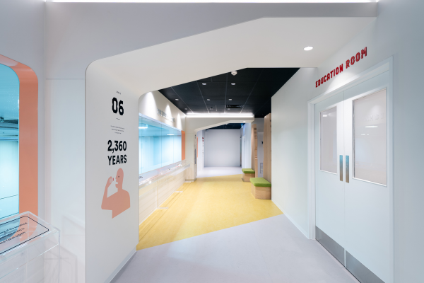
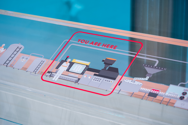
Yakult provided us with an extensive amount of data and information about the company's research and manufacturing process. The aim was to integrate this data into the space in an intuitive and accessible manner. The existing space was re-programmed into multiple distinctive zones, organised by using succinct infographics and carefully selected colour and lighting. Built forms, influenced by Yakult's bottle design was another medium used to demarcate these different zones.
Educational presentations and activities are carried out in the Education room. The walls of this space are lined with upholstered bench seating and interactive visual information. The layout was designed to be open and flexible so that furniture could be arranged to allow for various programs such as lectures, workshops, and agile group discussions - a move away from the conventional one-way lecture style of presenting.
Design Challenge
The main design challenge in this project was the translation of the company's ethos into a tangible spatial experience that communicates the Yakult brand. The design concept was to create a space that is utilitarian at its core, delivered with a bold design aesthetic that is warm and welcoming – science with charm.
We approached this by playing with familiar aspects of the brand and fusing it into the design. Hints of Yakult's iconic bottle appear throughout the design, sometimes in a literal sense and sometimes abstract – a nod to the timeless design of the bottle (which was, in fact, engineered to control the flow of liquid, to ensure that the drink was consumed slowly). The unique and familiar outlines of the Yakult bottle were contemporized and incorporated within various elements of the design including the gates and tunnels through the viewing corridors and in the customized font that was used in the graphic design. To showcase Yakult's manufacturing process, products, and exhibitions, a modest colour palette, akin to the clean tones of a laboratory was used.
Aligning the infographics into the spatial design was another challenge. It was essential that the wayfinding and infographics were subtle, yet informative, and simple to follow. Striking that fine balance between visual and spatial experience to avoid information overload, required carefully considered placement, scale, and volume of the visual communication aspects of the design. This led to a more immersive and intuitive experience for the viewer.
Sustainability
One of Yakult's key objectives of the visitor centre is to promote health, and this extends to environmental health – the foundation of human life. A conscious effort was made to address this wherever possible. Natural and recyclable materials were carefully selected for the majority of the project. The linoleum floor finish along the corridors are composed of natural materials, which are also carbon neutral. The cement ceiling panels installed in the education room are composed of renewable wood wool cement board (WWCB).
As this was a restoration project, extra care was made to retain and make use of the existing building fabric as much as possible to minimise wastage. The existing ceiling panels along the viewing corridors were retained and refreshed with a new coat of paint. The eleven existing large viewing panels that make up the main viewing areas were re-framed by installing new rounded openings, over the existing windows frames. To minimise the ecological footprint, locally sourced materials such as Australian made flooring, ceiling panels, and paint were used.
Interior Design - Corporate & Commercial
This award celebrates innovative and creative building interiors, with consideration given to space creation and planning, furnishings, finishes, aesthetic presentation and functionality. Consideration also given to space allocation, traffic flow, building services, lighting, fixtures, flooring, colours, furnishings and surface finishes.
More Details