


Project Overview
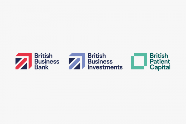
British Business Bank exists to make finance markets work better for smaller businesses and to drive economic growth throughout the UK. With the introduction of a new strategy, our brief was to develop British Business Bank’s brand architecture, leading to an evolved master brand and sub brands for its commercial subsidiaries British Business Investments and British Patient Capital.
Project Commissioner
Project Creator
Project Brief
With the introduction of a new strategy for the bank by strategic partners Engine, our brief was to develop the bank’s brand architecture, along with an evolved master brand and sub-brands for its commercial subsidiaries.
The bank’s new strategy is: “To get businesses, nationally and regionally across the UK, who are worried about their survival to recognise the British Business Bank is a brand they can trust to light the way; informing, enabling and reassuring them through difficult times and beyond by promoting the bank’s products and the information services that support them.” Our objectives were to build one clear and simple ‘hero’ brand to increase brand awareness with external and internal audiences.
Project Innovation/Need
It had to be easy for consumers to recognise and to understand the bank’s connected products and services. It also had to be resource efficient – one strategy, with shared approaches across sub-brands.
The approach is evolutionary, making the introduction of new products easier, and building on the brand’s inherent trust/equity with primary audiences – small and medium enterprises, and secondary audiences – financial intermediaries, third party advocates and delivery partners.
We interviewed key people and ran workshops, to understand what the bank means to existing and future audiences. We used the insights gained to develop the group architecture, master brand and its constituent parts.
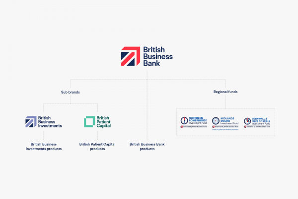
Since its inception in 2012, the British Business Bank brand has expanded to form a number of sub brands and product identities. We took a ‘branded house’ approach to the architecture to build equity. Structuring the brand in this way delivered the required efficiency – with one strategy, yet multiple shared approaches.
Design Challenge
The design challenge was to visually and verbally express the bank’s ‘lighting the way’ proposition. The ‘light beam’ graphic we developed is the visual embodiment of the proposition, echoing the geometry found in the logo, giving communications an upward drive and purpose.
We recommended a development of the logo and identity to create a robust, flexible and future-proof system, supported by a new visual approach across all elements including photography, illustration, infographics, a new, clearer typeface and a structured approach to icons and pictograms.
We created a new, expanded and accessible colour palette inspired by the rich diversity of British business and the British landscapes they are in. Photography guidance focuses on the diversity of life in the UK, expressed through portraits and reportage. It was important to reflect the geographic spread of small business, so a focus on regionality, showing recognisable landmarks was key to appealing to our UK-wide audiences. The new approach allowed us to effectively adjust the tone of communications for different audiences and subjects, while always retaining a coherent ‘brand voice’.
We developed comprehensive brand guidelines, outlining the brand’s architecture, proposition, mission and values. The verbal and visual identity guidance outlines the brand’s building blocks, which are put into practice in a brand application section showing website and publications in addition to a strict approach to social media and moving image.
Effectiveness
The result is a master brand that positions the bank as the go-to organisation for small and medium enterprises when they need finance, but also retains its appeal for other audiences across delivery partners, and other key stakeholders.
The refreshed brand has proved to be a unifying force across the organisation, giving a strong sense of shared purpose to the bank’s people. The refreshed brand would prove vital in supporting a major awareness campaign when COVID-19 gave fresh urgency to small business support. The brand cut through on social media platforms with a paid social campaign we created, delivering extraordinary results. To communicate as effectively as possible, the audience was segmented into three levels:
– Mass: made of the 2.7m businesses, including Permanent Non-Borrowers.
– Group: matching understanding of specific products and services to those most likely to need them. Includes regional focus through priority the sectors: construction, accommodation and food and beverage industries.
– Individual: re-targeting individuals who have already engaged with British Business Bank communications or website.
Facebook results for the first week:
– Mass: 1.1m video views. 225,140 100% video views: (301% above plan).
– Group: 1.1m impressions 51,000 link clicks: (761% above plan).
– Individual: 210,624 impressions. 5,750 clicks to Accredited Lenders: (4,500% above plan).
Graphic Design - Corporate Identity & Branding
This award celebrates creative and innovative design in the traditional or digital visual representation of brand, ideas and messages. Consideration given to clarity of communication, representation of brand values and the matching information style to audience.
More Details